
Walk through any paint aisle in 2026 and you see the same trends that have defined the last few years: bold jewel tones, warm earthy hues, and plenty of Instagram-ready accent walls. Homeowners love them. Buyers, according to a growing body of survey data from Zillow, Fixr.com, and the National Association of Realtors, do not always feel the same way.
Several paint colors that once felt fresh or personal are now quietly working against sellers, showing up in listing photos as a red flag rather than a selling point. The following ten shades keep surfacing in resale research as colors that cost sellers money, slow down showings, or simply make buyers picture a repaint before they picture themselves living there.
1. Ochre Yellow
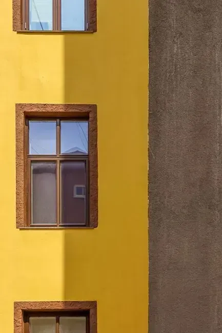
Ochre has become something of a cautionary tale in recent housing research. Zillow estimated that homes painted in the shade could receive offers more than $18,000 lower than comparable homes with more buyer-friendly colors. That is not a small dent in a sale price, and it is one of the largest single-color penalties found in the entire study.
The damage is not evenly spread across the house either. Kitchens painted ochre yellow alone could reduce offers by more than $6,600. Kitchens tend to be the room buyers scrutinize most closely, so a strong, brownish yellow in that space appears to carry an outsized penalty compared with other rooms.
2. Lime Green
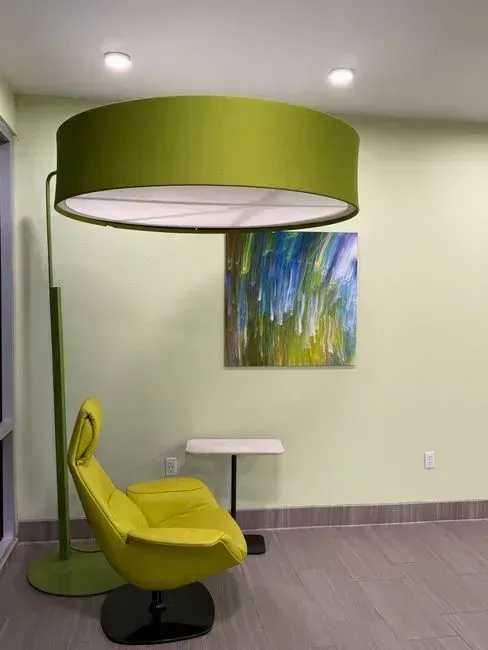
Lime green tops the list of colors that make stagers and design professionals wince. In a Fixr.com survey of home stagers and designers, lime green was named by 73 percent of respondents as an off-putting color for buyers. That figure is dramatically higher than any other shade in the survey, which says a lot about how narrow this color’s appeal has become.
Part of the issue is that lime green rarely reads as a neutral backdrop. It tends to dominate a room rather than sit quietly behind furniture and art, which leaves little room for a buyer to imagine their own style layered on top of it.
3. Bold Pink
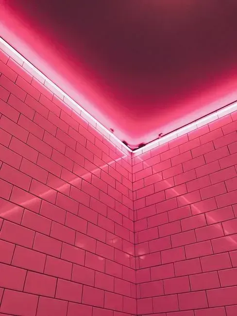
Soft blush and dusty rose still have a place in modern interiors, but saturated bold pink is a different story. Bold pink was named by 42 percent of professionals in the same Fixr.com survey as a buyer deterrent. The word bold matters here, since it is the intensity of the color, not the presence of pink itself, that drives the objection.
Realtors point to specific rooms where this color does the most damage. Bedrooms, playrooms, and bathrooms are the spaces where bold pink hurts most, since buyers need to mentally inhabit the room as their own rather than read it as someone else’s personality already installed. A muted, barely there version of the same hue tends to survive the transition into a listing far better than the saturated original.
4. Fire Engine Red
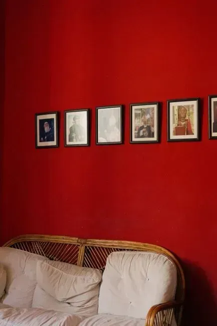
Red walls make a strong first impression, and that is exactly the problem for sellers. Red was flagged by 35 percent of professionals surveyed by Fixr.com as a color that turns buyers off. The color has a measurable financial cost attached to it as well.
Research from Redesign Daily found that fully saturated, fire hydrant red on large wall surfaces was associated with offer reductions of $1,800 to $2,000 in bedrooms and living rooms. Interestingly, deeper and earthier reds do not carry the same stigma, since richness of tone rather than raw saturation appears to be what separates a color buyers accept from one they reject.
5. Saturated Purple
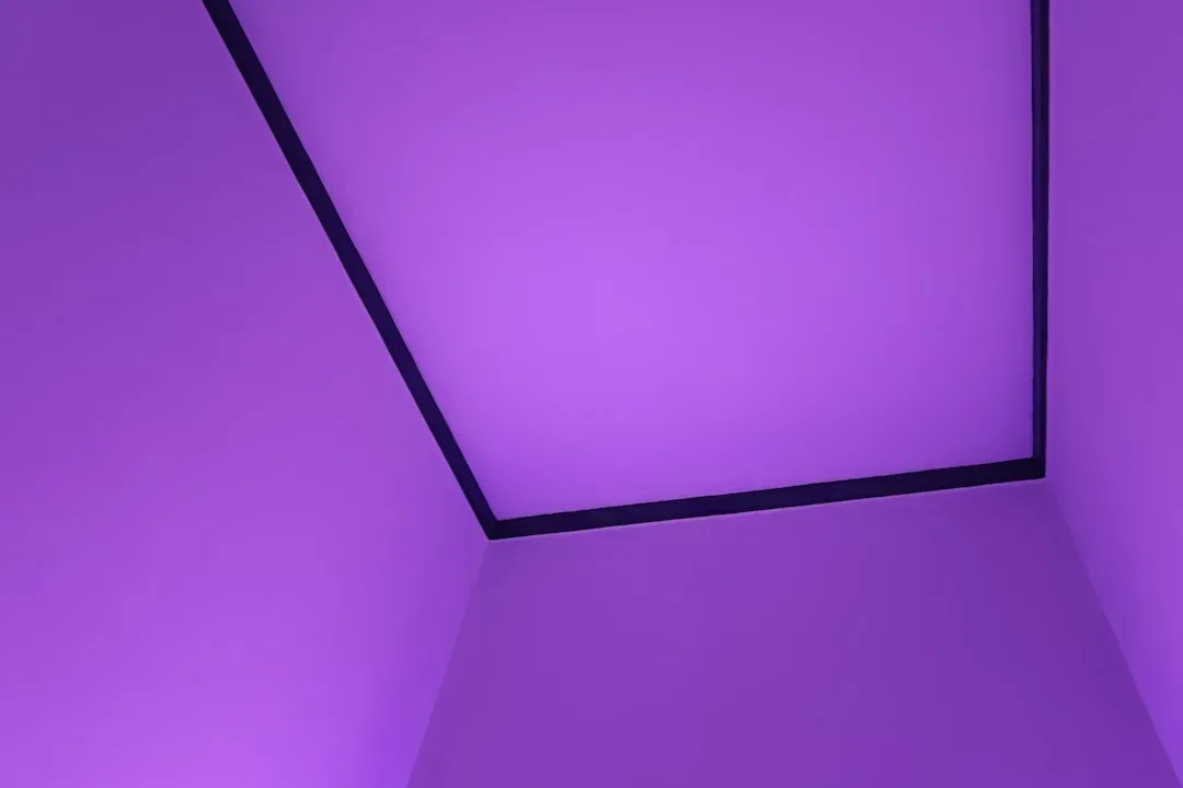
Purple in its brighter, more saturated forms struggles for the same reason lime green does: it rarely reads as neutral. A full 33 percent of stagers and designers surveyed by Fixr.com cited purple as a color that hurts a home’s appeal to buyers. That is a meaningful share of professionals who see the same pattern repeatedly across listings.
The issue tends to show up most in shared living spaces. Realtors flag living areas, bedrooms, and hallways as the worst contexts for saturated purple, since it defines too much of the visible home at once. A deep, brownish plum reads very differently and tends to escape the same criticism, since it functions more like a warm neutral than a statement color.
6. Bold Orange
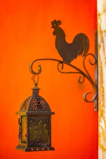
Bold orange has an unmistakable period feel, and that association is exactly what works against it now. Named by 30 percent of professionals in a late 2025 Alabama Realtors survey, bold orange carries a direct period association that ages the room alongside it. It is a color that instantly places a room in a specific decade rather than letting it feel current.
Smaller spaces suffer the most from this shade. Small rooms and hallways tend to be hit hardest, since there is no visual relief from the intensity of the color. A muted terracotta or burnt orange tone tends to deliver the same warmth without pinning the room to a particular era.
7. Mustard Yellow
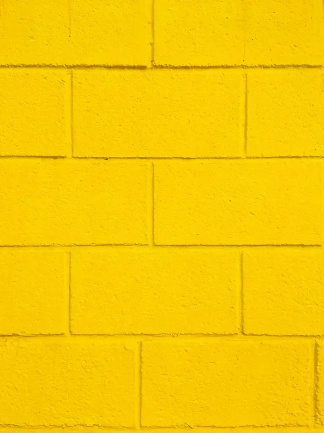
Mustard sits in an uncomfortable middle ground between trendy and dated, and buyers seem to notice. Mustard yellow was named by 20 percent of stagers and designers as an off-putting color for buyers in the Fixr.com survey. That places it below colors like lime green and bold pink, but it is still a significant enough share to raise concern.
Yellow tones in general carry a specific risk in listing photography. Real estate broker Erik Leland has noted that yellow is very polarizing, and in listing photos the color often casts a sickly, jaundiced tone over everything in the room. That kind of photo problem can discourage buyers before they ever schedule a showing.
8. Daisy Yellow
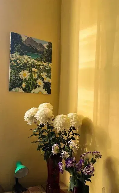
Even the cheerier, brighter cousin of mustard has not escaped scrutiny. According to a mid-2025 analysis, daisy yellow walls in kitchens or living rooms were associated with offers roughly $3,900 lower. That is a notable gap for a color many homeowners still choose specifically because it feels upbeat and welcoming.
The challenge with any strong yellow is that it interacts unpredictably with natural and artificial light. It can shift undertone throughout the day, which makes it harder for buyers to judge a room’s true feel from photos alone, and harder for agents to correct in editing.
9. Charcoal and Dark Gray Walls
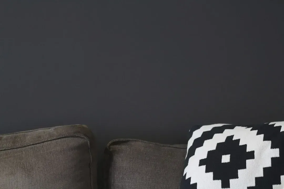
Dark, moody walls had a real moment over the past several years, but that moment appears to be fading. Charcoal walls had their moment, and once trendy choices can quickly date a home as buyers take notice. What once looked dramatic and design forward can now read as heavy or closed in.
Lighting conditions make the problem worse in certain climates. Dark wall colors are especially problematic in overcast climates, where they only compound the gloom. Real estate broker Erik Leland has observed that buyers walk in and immediately comment on the house feeling dark when charcoal dominates a room.
10. Cold, All Gray Interiors
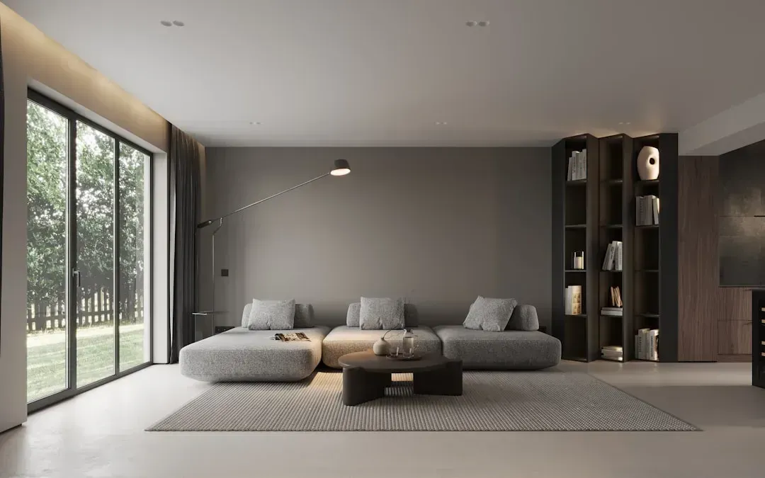
Gray was the default neutral for much of the last decade, but an all gray palette now carries its own risk. Some warm grays still work, but cold gray on gray interiors can feel dated in 2026 if flooring, cabinets, and lighting also read gray. The effect is a home that feels flat and monochrome rather than calm and neutral.
Design experts increasingly steer sellers toward alternatives with more warmth. Neutral grays, off whites, and light earth tones remain top picks for broad buyer appeal in 2026, beating out last decade’s stark white or builder beige, but the emphasis has shifted toward grays with a warmer undertone rather than the cool, blue leaning grays that once dominated staging guides. A home layered entirely in cool gray tones can end up feeling less like a blank canvas and more like an unfinished one.
The Bigger Shift Behind These Numbers
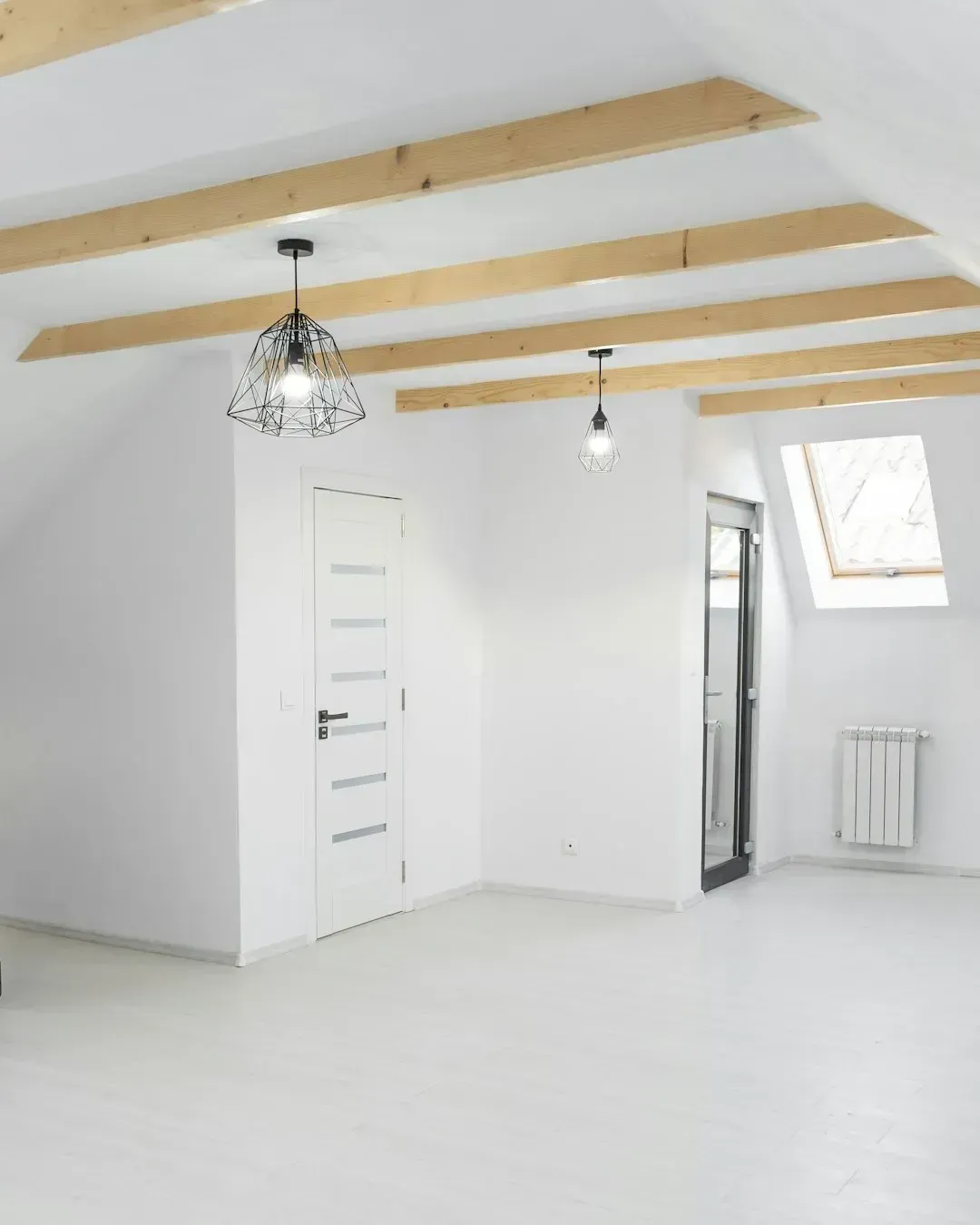
Even plain white, long considered the safest possible choice, is no longer an automatic win. The biggest surprise of Zillow’s research is that white paint, which most people take for granted as an obvious resale winner, was not home buyers’ top pick. Zillow’s home trends expert has pointed out that defaulting to all white walls could leave money on the table, since buyers today respond to homes with soul, and paint is one of the easiest ways to add personality and character to a space.
Taken together, the research points to a market that has grown more particular, not less colorful. Buyers are not rejecting color outright, since Zillow’s 2026 Paint Color Analysis, based on responses from more than 4,400 recent and prospective home buyers, found that certain shades can raise a home’s price by thousands of dollars. The colors struggling in 2026 tend to share one trait: they ask buyers to accept someone else’s strong personal taste rather than offering a warm, adaptable backdrop for their own.


Leave a Reply