
1. All gray everything
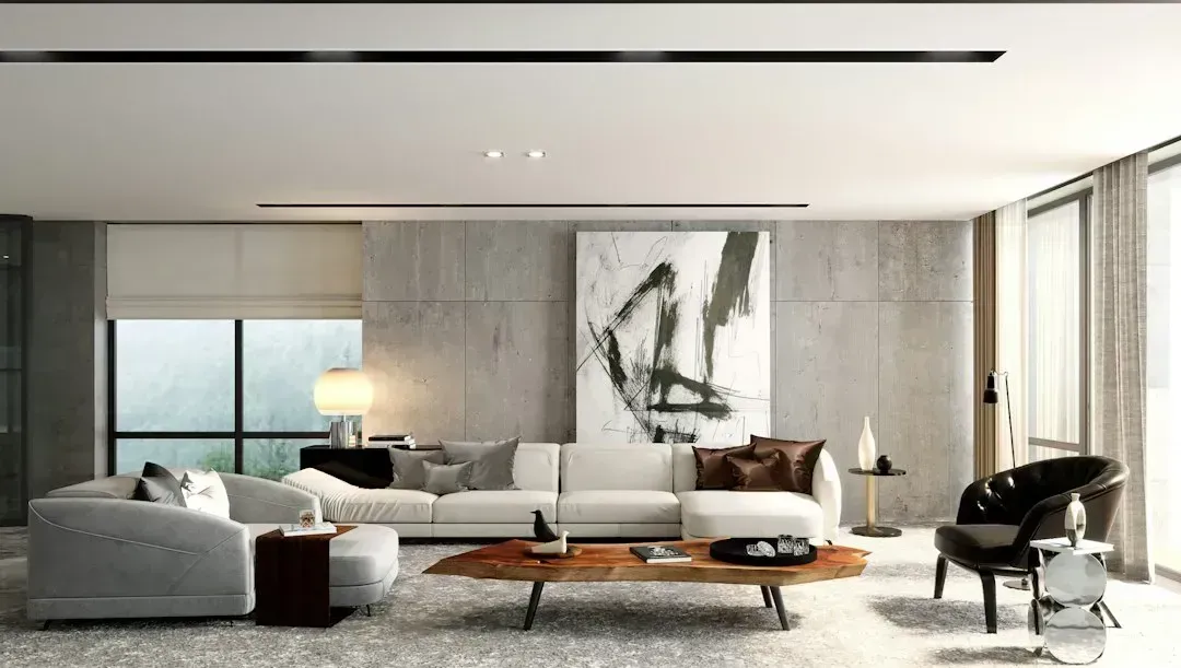
Gray dominated interiors for the better part of the 2010s, showing up on walls, floors, cabinets, and even furniture in the same room. Designers say the look has aged into something that feels flat and a bit cold, especially in homes with limited natural light. What once read as sleek now often reads as sterile, particularly when every surface matches the same cool undertone.
The shift away from gray has been driven partly by a broader move toward warmer, richer palettes that feel more lived in. Designers are steering clients toward warm neutrals like greige, taupe, and soft browns instead of straight gray. The change isn’t about abandoning neutrals altogether, it’s about choosing ones with more depth and warmth.
2. Barn doors on everything
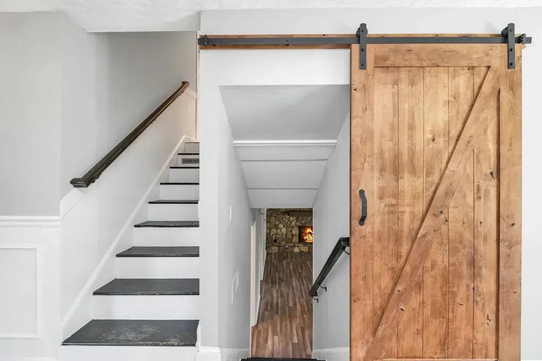
Sliding barn doors became a shorthand for farmhouse style after home renovation shows popularized them in the mid 2010s, and for a while they showed up on pantries, bathrooms, and even bedrooms where they offered no real privacy. Designers now point out that the trend was often applied without much thought to whether it actually suited the architecture of the house. A barn door on a modern condo or a colonial-style home tends to look like an afterthought rather than an intentional design choice.
Practical issues have also caught up with the aesthetic ones. Barn doors don’t seal rooms acoustically or visually the way a hinged door does, which matters a lot for bathrooms and bedrooms. Many designers now recommend swapping them out for pocket doors or standard doors with better hardware, keeping the space-saving benefit without the sound and privacy tradeoffs.
3. Shiplap on every wall
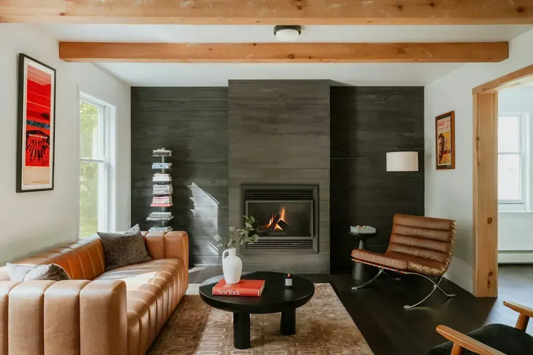
Shiplap became nearly inseparable from farmhouse decor after it was heavily featured on renovation television in the 2010s, and it spread from accent walls to entire rooms in some homes. Designers note that overuse is what dates it most. A single shiplap wall can still work as a textural accent, but a whole house covered in it starts to feel like a themed rental rather than a personal home.
The bigger issue is that shiplap is tied so closely to one particular aesthetic moment that it now signals a specific era almost immediately. Homes that leaned hard into farmhouse style around 2015 to 2018 often show their age through this one material more than any other. Removing or painting over excess shiplap is one of the more common requests designers get during refreshes.
4. Accent walls in bold, single colors
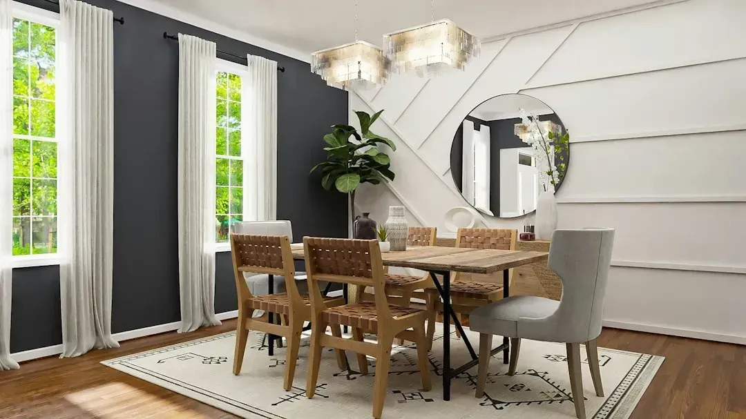
The classic accent wall, one wall painted a dramatically different color than the rest of the room, was a defining feature of early 2000s and 2010s decor. Designers say the effect can feel arbitrary now, especially when the color choice doesn’t connect to anything else in the room’s palette. A deep red or navy wall surrounded by three white walls often reads as dated rather than deliberate.
Current approaches to color and contrast tend to be more cohesive, using tonal variation, wallpaper, or millwork instead of a single flat color swap. When designers do use bold color now, it’s typically applied with more intention, such as painting trim, ceilings, or built-ins to create depth rather than isolating one wall. The goal has shifted from making a statement to creating harmony.
5. Chevron and herringbone everywhere
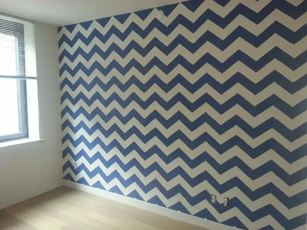
Chevron patterns had a strong run on pillows, rugs, and even accent walls, particularly in gray and white or yellow and gray combinations that were everywhere around 2012 to 2016. Designers note that the pattern itself isn’t inherently bad, but the sheer volume of chevron products flooding home decor at the time makes it instantly recognizable as belonging to that period. Herringbone flooring has fared a bit better because it’s a more classical pattern with roots going back centuries, but the chevron textile trend specifically reads as very of its moment.
What’s replaced it is a move toward more organic, less geometric patterns, including botanical prints and abstract designs with softer lines. The pendulum has swung toward patterns that feel timeless rather than trend-driven. Designers suggest that if a pattern was sold in nearly every home goods store at once, it’s worth reconsidering now.
6. Word art and script wall decor
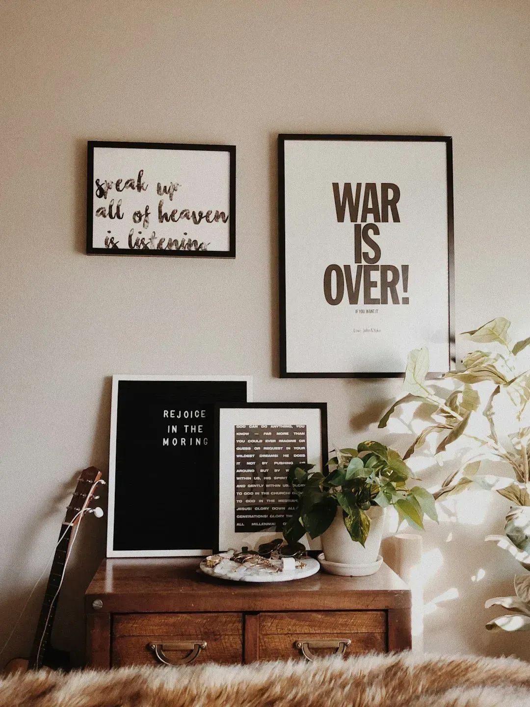
Wooden signs and canvas prints with inspirational words or family names in cursive script became a fixture of mass market home decor through the 2010s, largely fueled by big box retailers making them cheap and widely available. Designers describe this category as one of the clearest markers of a home that hasn’t been updated recently. The sentiment behind the pieces was genuine, but the sheer ubiquity turned them into visual clutter rather than meaningful decor.
Personal touches haven’t disappeared from design, they’ve just shifted toward more original expressions like curated photography, artwork from independent artists, or objects with real personal history. Designers generally encourage clients to choose pieces that mean something specific to them rather than mass produced sentiment. The difference is subtle but noticeable, one feels personal and the other feels purchased in bulk.
7. Tuscan-inspired kitchens
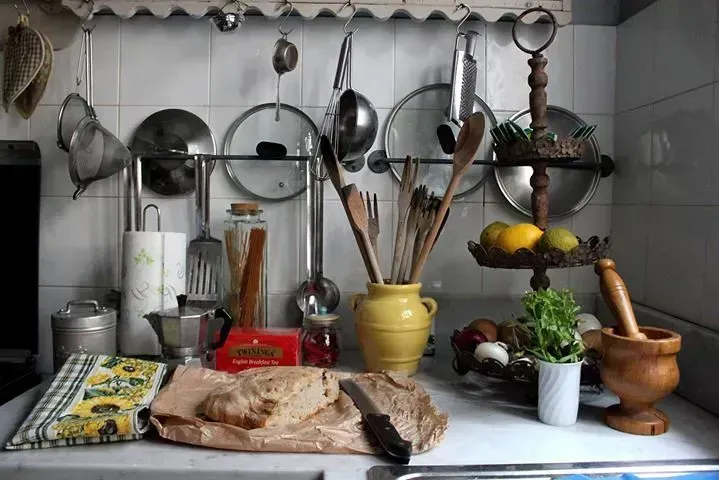
Heavy, ornate kitchens with dark wood cabinets, wrought iron fixtures, and warm gold or terracotta tones defined a specific luxury aesthetic in the early to mid 2000s. Designers point out that these kitchens now feel heavy and dated compared to the lighter, simpler palettes that have dominated kitchen design for the past decade. The style required a lot of visual commitment, from the cabinetry down to the light fixtures and backsplash tile.
Current kitchen trends favor simplicity, with white and warm wood tones, cleaner lines, and less ornamentation overall. Full kitchen renovations are expensive, so many of these Tuscan-style kitchens are still out there, quietly aging in otherwise updated homes. Designers often flag them as one of the most immediate giveaways of a home’s last major renovation date.
8. Popcorn ceilings
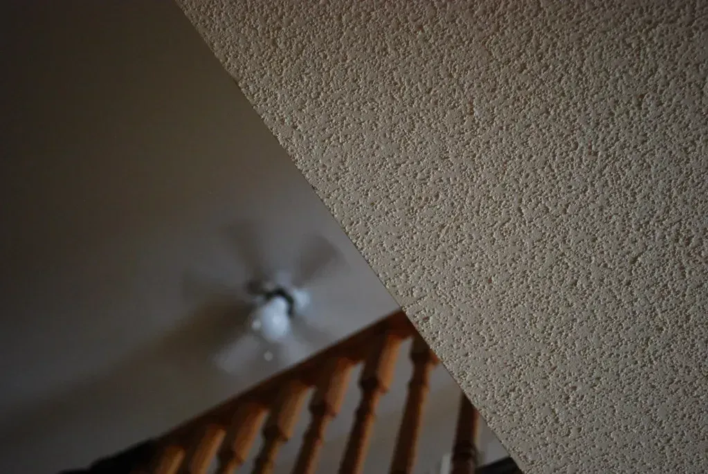
Textured popcorn ceilings were standard in new construction from the 1950s through the 1980s, largely because the texture was cheap to apply and helped hide imperfections in the ceiling surface. Designers consistently name this as one of the fastest ways to make a home feel outdated, regardless of how updated the rest of the space is. The texture also tends to collect dust and can be difficult to clean without damaging it.
Removing popcorn ceilings has become one of the more common renovation requests, though it requires care since ceilings installed before the early 1980s may contain asbestos and need professional testing before removal. Once removed, smooth ceilings immediately make rooms feel brighter and more current. It’s one of the few updates designers describe as almost universally worth the effort.
9. Matching furniture sets
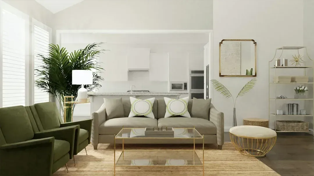
Buying an entire living room or bedroom set from one manufacturer, sofa, loveseat, coffee table, end tables, and all, was a common approach for decades, especially in the 1990s and 2000s. Designers now describe overly matched furniture as one of the clearest signs a room hasn’t been thoughtfully updated. The uniformity can make a space feel like a furniture showroom rather than a home someone actually lives in.
The current approach favors mixing pieces from different sources, blending old and new, high and low price points, and varying wood tones and materials within the same room. This layered look takes more effort to pull together but tends to feel far more personal and current. Designers often suggest keeping one or two matched pieces at most and building the rest of the room around them individually.
10. Overly matched Live, Laugh, Love style clutter
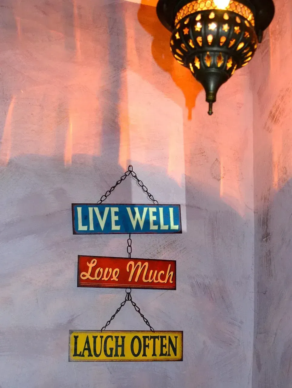
Beyond the word art specifically, an entire category of coordinated decorative clutter, matching throw pillows, coordinated candle sets, and themed seasonal displays, became a signature of a particular mass market decorating approach in the 2010s. Designers say this over-coordinated abundance now reads as visually busy rather than warm or welcoming. The instinct to fill every surface and coordinate every accessory has given way to more restrained, curated displays.
Minimalism hasn’t fully taken over, but there’s been a clear move toward fewer, more intentional objects rather than themed collections of matching accessories. Designers now often recommend editing down decorative items by a significant amount, keeping only pieces that have real visual or personal value. The result tends to feel calmer and, ironically, more considered than a room packed with coordinated accents.
These trends share a common thread. Each one was popular precisely because it was easy to replicate, widely available, and heavily marketed at a specific moment, which is exactly why they now stand out as dated once that moment passes. Recognizing them isn’t about following every new trend that replaces the old one, it’s about understanding why certain choices age well and others don’t.




Leave a Reply