
Walk into enough homes and patterns start emerging. The same curtains hung an inch too short. The same rug, too small by half, floating awkwardly in the center of the room. Designers see these things not because they’re being picky, but because years of training make certain mistakes hard to unsee once you know what to look for.
None of this is about shaming anyone for their taste. Decorating a home is personal, and getting things wrong the first time is practically a rite of passage. Still, a handful of habits show up again and again, in house after house, and most of them are surprisingly easy to fix once you’re aware of them.
1. Hanging Curtains Too Low and Too Short
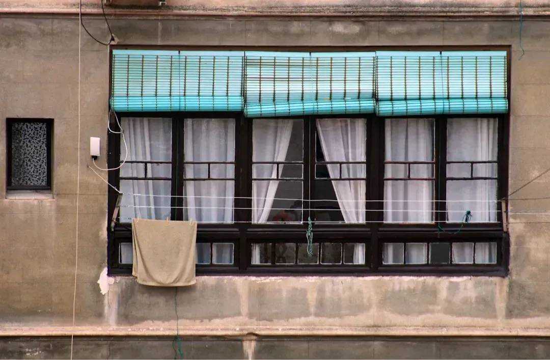
One of the most common decorating mistakes involves curtains, from passing on them altogether to opting for a too-short pair to save a bit of money. Designers almost universally agree on the fix: go high and wide. The rule of thumb is to hang the curtain rod four to six inches above the window frame, extending it outwards so the curtains just dust the sides of the frame, and the curtains themselves should always touch the floor.
Floor-length curtains help create more visual height, particularly in a small space, and draw the eye upward. Short curtains make ceilings feel lower and windows feel smaller. It’s a relatively cheap fix that makes a disproportionately large difference in how finished a room looks.
2. Using a Rug That’s Way Too Small
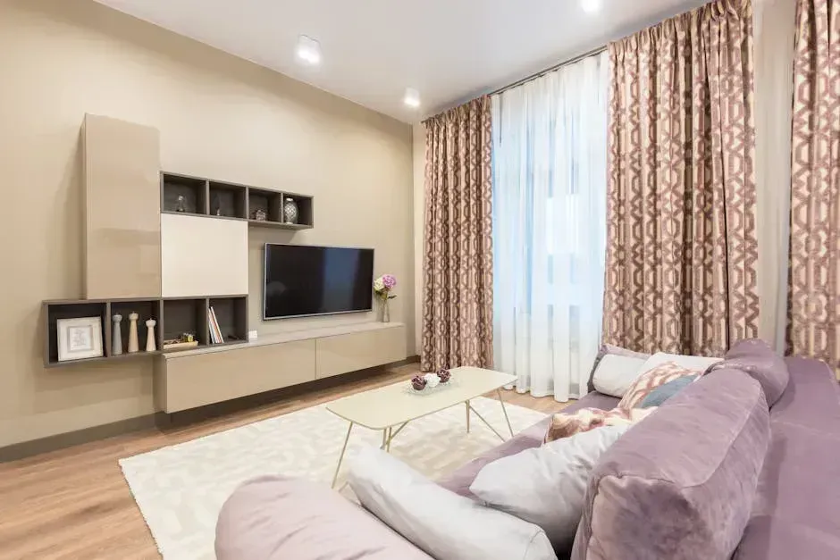
A rug that is too small can make a space feel discordant, or smaller than it actually is, especially if furniture pieces are floating off of it. The psychological effect is real. The rug’s size visually defines the room, so placing a small rug in the center of a spacious living area means that limited footprint is what people perceive as the actual living space.
Opting for a generous-sized rug is one of the best decisions you can make to ensure a room looks expensive and well-designed, since skimping on square footage can immediately throw off the room’s balance. The general rule is that at least the front legs of a chair or sofa should be on the rug. When in doubt, go a size up from what feels comfortable.
3. Pushing All the Furniture Against the Walls
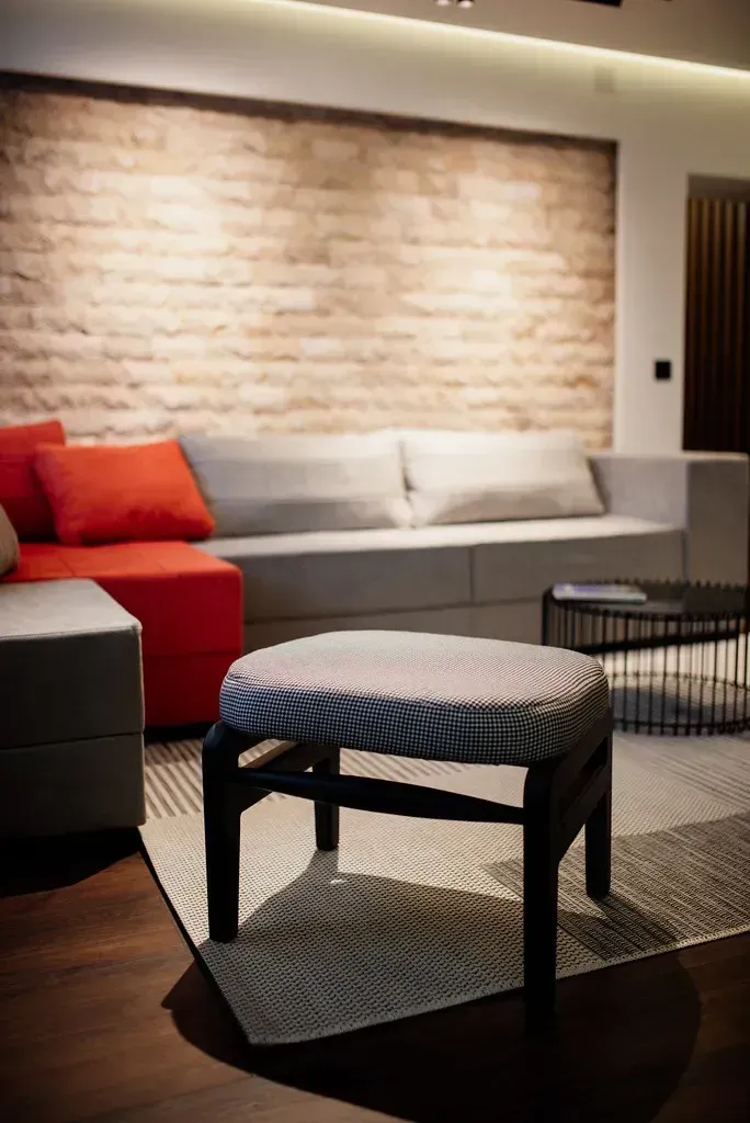
A common design mistake is placing all of the furniture along the walls, leaving the center of the room bare and empty. Floating some of the furniture off the walls, particularly sofas and accent chairs, actually gives the illusion of a larger, more layered space. It feels counterintuitive, but it works every time.
While it might seem like the best way to open up a room, placing all furniture against the walls can actually make the space feel disconnected and sparse. Grouping pieces toward the center of a room creates conversation zones and a sense of intentional arrangement, rather than furniture that looks like it’s afraid of the middle.
4. Ignoring Scale and Proportion
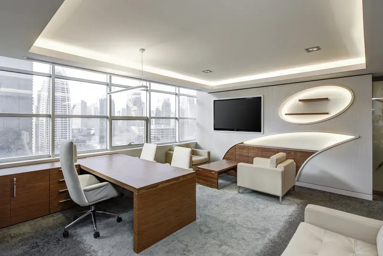
Neglecting the scale and proportion of furnishings can disrupt the visual harmony of a room. Furniture sizes need to be proportionate to the space and to each other to ensure a balanced appearance. This is one of those problems that’s hard to name until you walk into a room and something feels off without knowing exactly why.
It’s essential to choose pieces that are appropriately sized for the room, since oversized furniture can make a room feel cramped while undersized pieces make it feel empty and disjointed. Before purchasing any furniture, taking measurements and carefully considering how each piece will fit into the overall design is critical. With online shopping making it easy to buy without seeing, this mistake has become more common than ever.
5. Relying on a Single Overhead Light Source
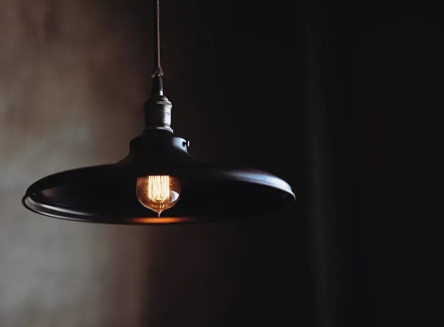
Neglecting proper lighting is a pervasive interior design mistake. Inadequate lighting can make a space feel dull and uninviting, and the fix is to incorporate a mix of ambient, task, and accent lighting to enhance functionality and atmosphere. Yet most homeowners default to one ceiling fixture and call it a day.
Lighting is a crucial element in interior design that is often overlooked. Many people rely solely on overhead lighting, which can create harsh shadows and fail to highlight the room’s features. Instead, a combination of ambient, task, and accent lighting creates layers of light that enhance the atmosphere, with floor lamps, table lamps, and sconces all contributing to a warm and inviting ambiance.
6. Buying Perfectly Matched Furniture Sets
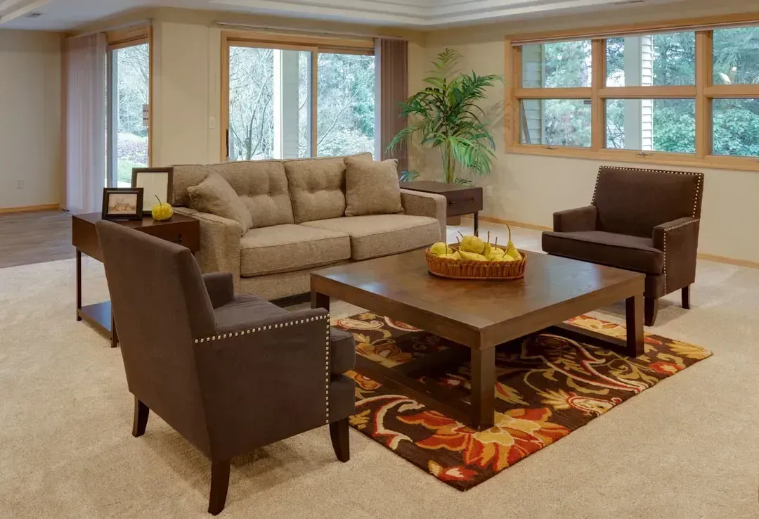
At the top of every outdated furniture trends list, matching furniture sets are one of the quickest ways to make a home look dated in 2025 and beyond. It made sense as a concept once, but the reality is that rooms built around matching sets tend to feel static and showroom-generic. Matching everything creates a flat visual experience. When wood tones, silhouettes, and upholstery all repeat the same language, the eye has nowhere interesting to go, and designers have long pointed out that contrast is what gives a room rhythm.
A home built around matching sets can look dated the moment that collection falls out of style, while a layered room evolves more gracefully because it was never dependent on one trend to begin with. The better approach is to mix eras, textures, and finishes, keeping the room feeling personal rather than purchased as a package.
7. Hanging Artwork Too High
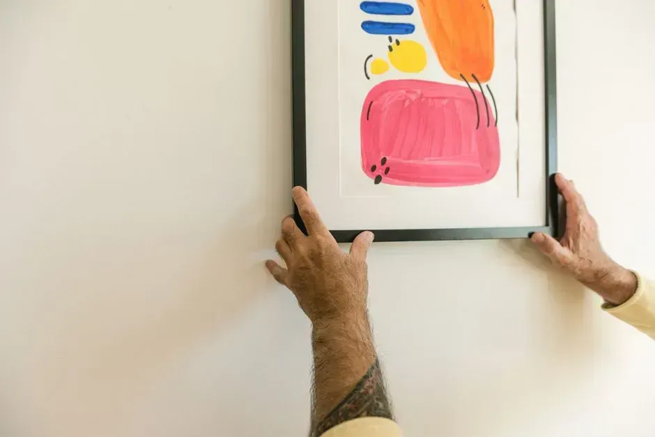
Art that is hung too high can throw off the balance of a room. The general rule is to mount the center of the art piece at eye level, or approximately 54 to 60 inches from the floor. This is something designers notice immediately, and it’s one of the easiest fixes in the book. Most people hang things too high because it feels more prominent that way, but it actually creates a visual disconnect.
One of the most common decorating mistakes is hanging artwork too high or choosing pieces that are too small for the wall. Another is using art with heavy contrast or bold patterns that compete with the TV screen. Both mistakes share the same root cause: choosing placement by instinct rather than by measurement. A tape measure and a few minutes make a real difference here.
8. Chasing Every Passing Trend
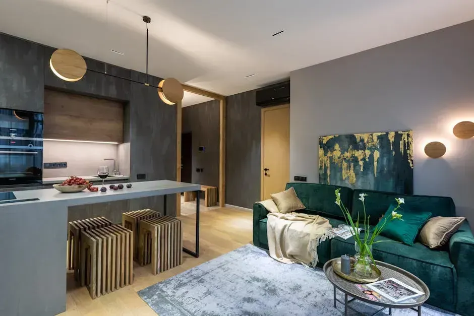
Homeowners need to be mindful of just how short trend cycles are and that many popular design strategies will be replaced by new fads in the coming years. Balancing the trend-homeowner dynamic is a constant struggle for interior designers aiming to create a timeless home that will endure for decades. Social media has made this worse, with new aesthetics cycling in and out faster than most renovations can be completed.
Design “cores,” including Cluttercore, Cottagecore, Grandpacore, Fantasycore, and Barbiecore, tend to be overly themed styles that fade as fast as an Instagram story and rarely translate well in real life. A home that chases every trend ends up feeling like a scrapbook of every phase its owner went through rather than a coherent, personal space.
9. Mounting the TV Way Too High
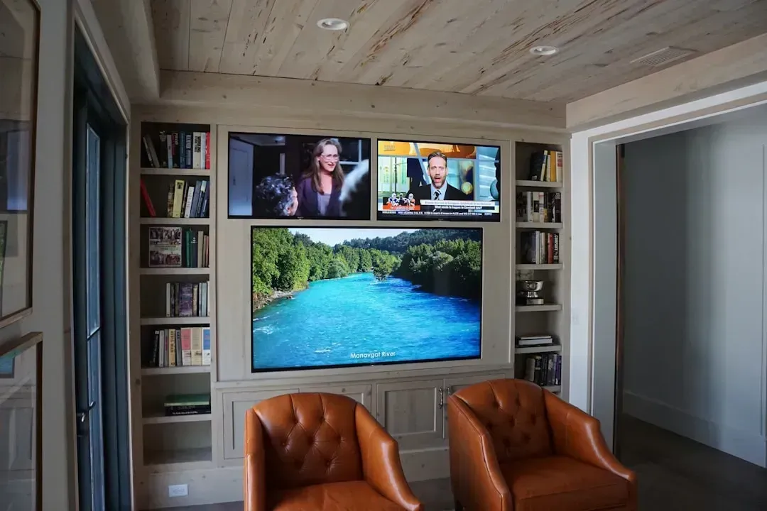
TV placement is often more of an afterthought than a design choice, but it shouldn’t be. Mounting a TV too high or off-center can lead to discomfort and a disjointed layout. Ideally, a TV should be at eye level when seated and shouldn’t be the sole focal point of the room. Neck strain after a movie night is a pretty reliable indicator that the screen is too far up the wall.
The TV center should be mounted at eye level when seated, usually 40 to 42 inches from the floor. In large rooms or rooms with bar seating, raising it slightly is acceptable. The instinct to mount high probably comes from thinking more screen visibility equals more impact, but comfort matters more than visual drama when you’re sitting there for two hours.
10. Overcrowding Every Surface and Corner
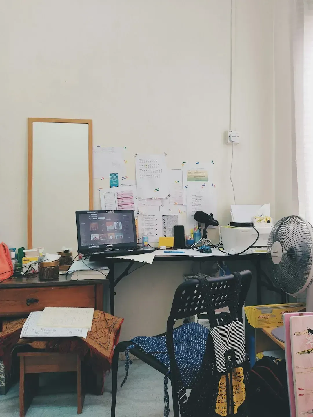
Overloading a space with furniture is a common mistake that leads to a cluttered and cramped feeling. Prioritizing quality over quantity and allowing for ample circulation space promotes a more breathable and comfortable environment. The same logic extends to surfaces, shelves, and tabletops. More is not always better, even when every individual piece is attractive.
Overcrowding a room with excessive furniture and accessories diminishes the visual appeal and disrupts the functionality and flow of the space. Each piece should have its own purpose and contribute to the overall harmony of the room. When every corner is cluttered with unnecessary items, it overwhelms the senses and diminishes the impact of the design elements that truly matter.
11. Treating Open Shelving Like a Storage Dump
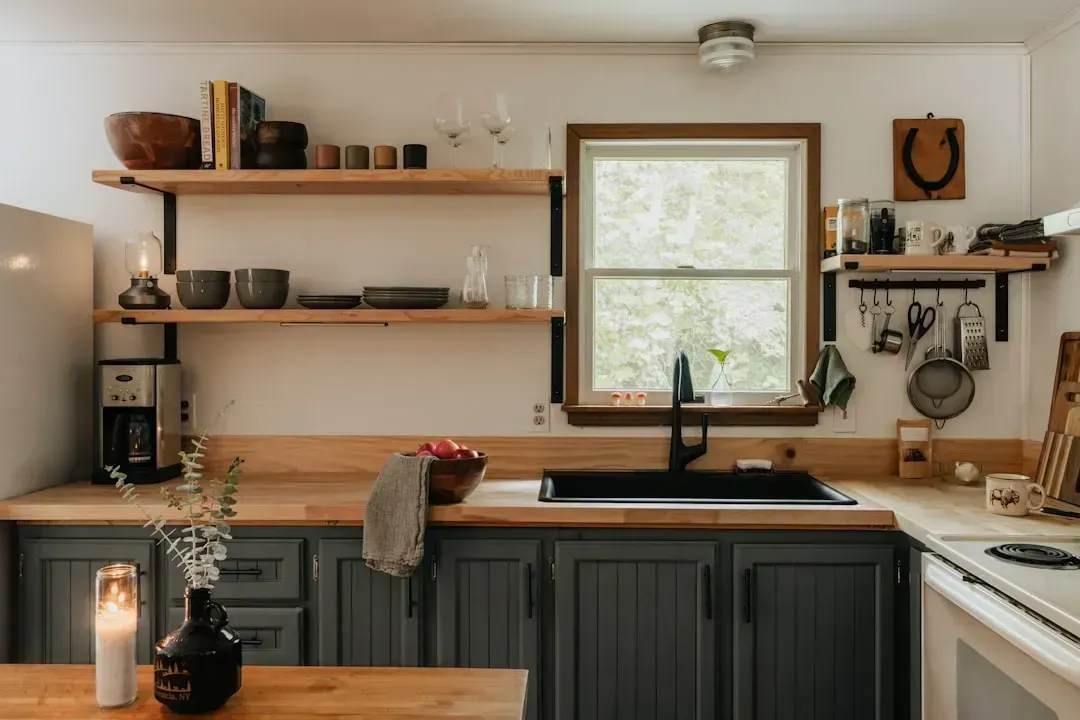
Some homeowners really miss their upper kitchen cabinets once they’re gone. The pressure of keeping dishes pristinely displayed and organized wears thin quickly. Certainly, open shelves in lieu of upper cabinets can be a great design solution in small kitchens where you may need to trick the eye, but in most kitchens, cabinets are beloved for their organizational sanity and help make a kitchen look nicer too.
Open shelving only works when you’re genuinely committed to keeping it curated. Open shelving is an up-and-coming trend, but without discipline, the effect is just messy. Designers suggest treating open shelves as a display, not as extra storage, and editing ruthlessly. A few well-chosen objects beats a shelf crowded with random kitchen overflow every time.
12. Decorating Without a Plan
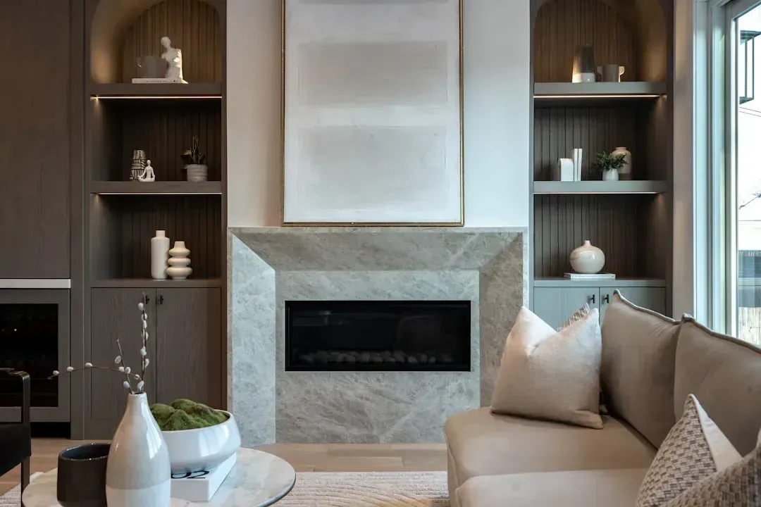
So many interior design mistakes wouldn’t happen if there were a thorough and cohesive decorating plan. Walking into a furniture store without a crystal-clear blueprint for what one needs is a recipe for disaster. It sounds obvious, but the temptation to browse first and figure out placement later leads to rooms that feel assembled rather than designed.
It’s the same when furnishing a home as it is when building one. It’s not easy, and making a strong plan before shopping helps avoid a lot of mistakes. Even a rough floor plan with measurements, drawn on paper, protects against the very common and very expensive problem of buying furniture that simply doesn’t fit the room it was intended for.
13. Choosing Flat, Soulless White Walls Without Variation
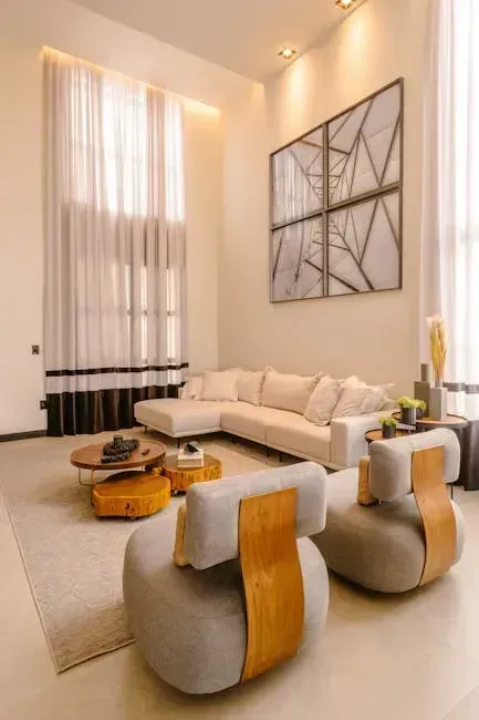
Homeowners are moving away from stripped-down spaces in favor of layered, warm, and timeless ones. One trend that is fading is the use of stark, ultra-bright whites as a wall color, since crisp whites had a long moment but can sometimes feel flat or sterile. All-white rooms can work beautifully when handled with care, but they require texture, warmth, and layering to avoid feeling clinical.
Not varying your paint color can make a room feel one-noted. Using one shade for the walls, another for the trim, a third for the cabinets, and a fourth for a hood vent results in a nuanced room with layers of interest that keep the eye moving. The single-white-throughout approach, common in flipped houses and minimalist aspirations alike, tends to age quickly and feel impersonal.
14. Buying Fast Furniture That Won’t Last
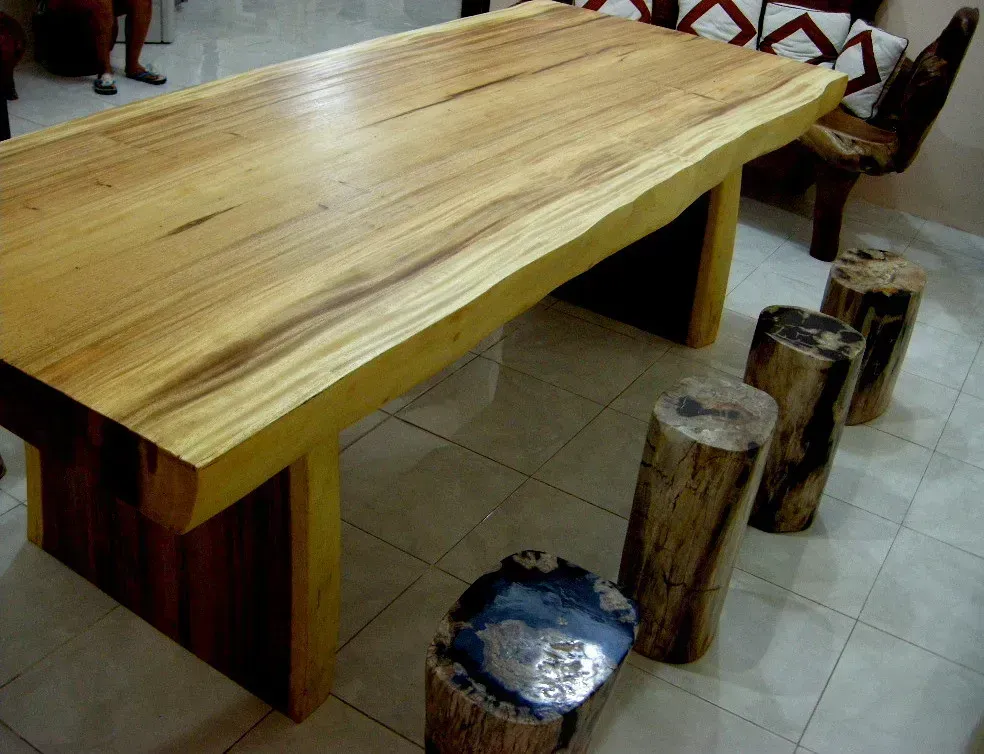
As more people favor quality over quantity, there is less room for furniture trends that lack endurance and sophistication. Dubbed “fast furniture” due to the faster design and making process, many designers are tired of seeing cheaply made pieces. These pieces often look fine in the store or in product photography, but deteriorate noticeably within a couple of years of regular use.
The appeal is understandable. Fast furniture is affordable and accessible. Still, there’s more to consider than just aesthetics when decorating. Many items look great online, but once they arrive, homeowners realize they lack functionality. Investing a little more in fewer, better pieces nearly always yields a better result over the long term than filling a room quickly with things that need replacing in three years.
15. Skipping Texture Entirely
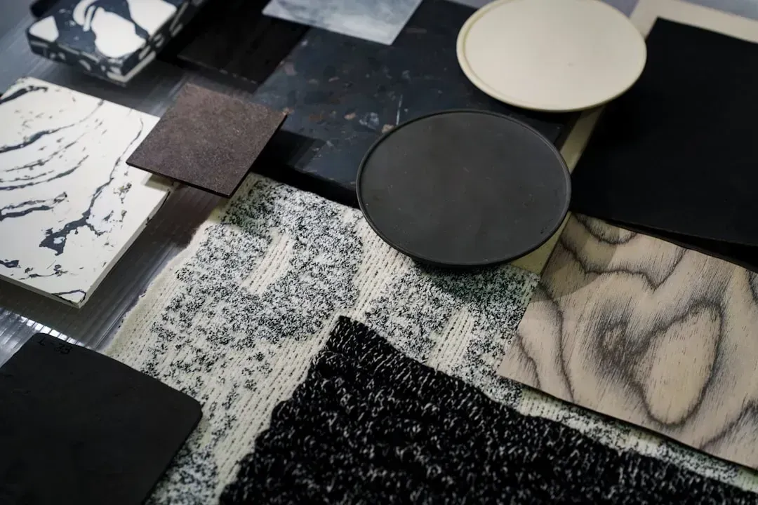
A common mistake is neglecting the importance of texture in interior design. Introducing a variety of textures through fabrics, materials, and finishes adds depth and visual interest, preventing a monotonous and flat appearance. Rooms that rely only on color for visual interest tend to feel a bit thin, no matter how good the palette is.
Texture is what gives a room warmth and physicality. Combining linen, wood, stone, metal, and woven materials makes a space feel genuinely inviting rather than like a rendered image. Material mixing matters just as much as style mixing. Rooms feel richer when they combine wood, metal, stone, linen, leather, glass, and woven textures instead of repeating one finish over and over.



Leave a Reply