
1. Exaggerated Curves on Every Surface
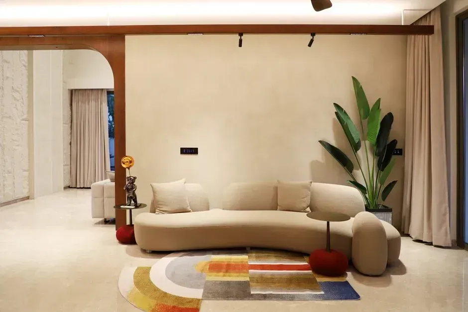
Curved sofas, round coffee tables, and squiggly mirrors defined the last few years of soft, organic design. Curves in interior design create flow and add depth to schemes, but too many can feel a little overkill, and while round coffee tables, curved sofas, and squiggly mirrors were all the rage not long ago, they’re starting to feel like a bit of a fad in 2026. Designer Jacqueline Wens put it bluntly, noting that “Curves on everything is trend I am sick of seeing in 2026.”
The issue is not curves themselves but the lack of contrast that comes from overusing them. When a room is all curves, nothing feels grounded, there’s no contrast, and the eye doesn’t know where to land. Designers now recommend pairing one curved piece with something linear, like a sculptural sofa next to a sharp-edged side table, so the room has tension instead of monotony.
2. Quartz Countertops
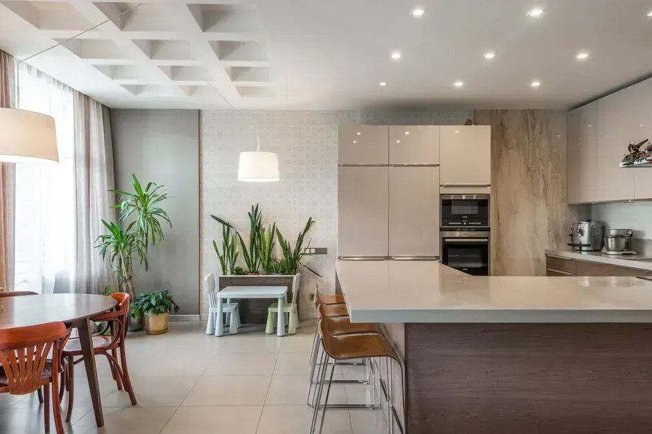
Quartz spent years as the default choice for anyone renovating a kitchen, prized for being nearly indestructible and endlessly consistent. For many, quartz countertops are the symbol of luxury, deeply sophisticated yet grounding and durable, and quartz is, on paper, the ultimate kitchen countertop material. Yet that very consistency is starting to work against it.
Designer Kelsey Peterson offered one of the sharper lines on the subject, calling quartz “Quartz countertops! It’s our generation’s laminate.” Her point is that a material engineered to look flawless can end up feeling flat next to natural stone, since nothing compares to the touch, feel and weight of a natural stone countertop. Marble, with its imperfections and history of use in older homes, is increasingly the material designers reach for instead.
3. All-White Kitchens
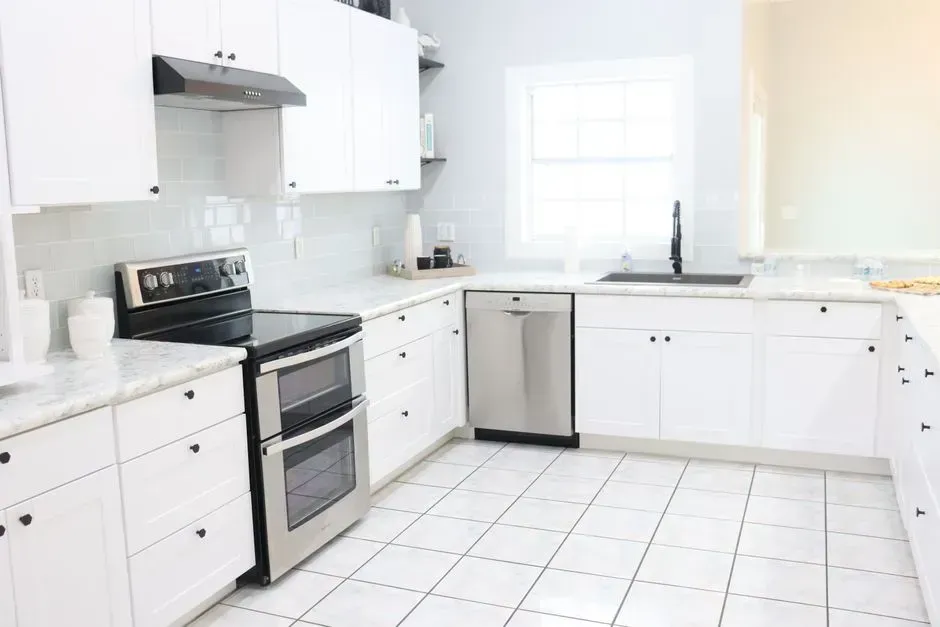
The all-white kitchen has been a fixture of American homes for well over a decade, prized for feeling clean and resale-friendly. Designers have been predicting the end of the all-white kitchen for years, but one designer says 2026 is when the shift truly takes hold. The reasoning is straightforward: white kitchens photograph well but rarely feel personal.
Designers now describe a move toward color and texture instead. As one puts it, “All-white kitchens will be replaced by more vibrant, colorful alternatives. We will be more open to experimenting with bold cabinetry, unique backsplashes, and mixed materials, transforming kitchens into focal points of creativity and personality.” A separate report on outdated design choices echoes the same shift, noting that all-white spaces, often seen in bathrooms or kitchens, are going to be a thing of the past, since in previous years white color schemes were liked for their brightness, cleanliness, neutrality and calmness, but today that stark backdrop is much too sterile.
4. Matchy Furniture Collections
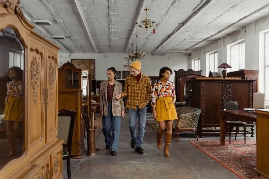
Buying an entire room from one collection used to feel like the safe, efficient option. Designers now see it as a shortcut that drains a space of personality. Buying everything from one store or furnishing a room entirely from a single collection may be convenient and often cheap, but designers say it results in flat, predictable spaces.
One designer summed up the problem this way: “Spaces where everything matches perfectly from the same collection are beginning to feel flat and predictable. When a room looks like it was completed all at once, it often lacks character.” The alternative gaining traction involves mixing pieces from different eras and finishes so a room reads as collected over time rather than purchased in a single afternoon.
5. Fast Furniture and Trend-Driven Dupes
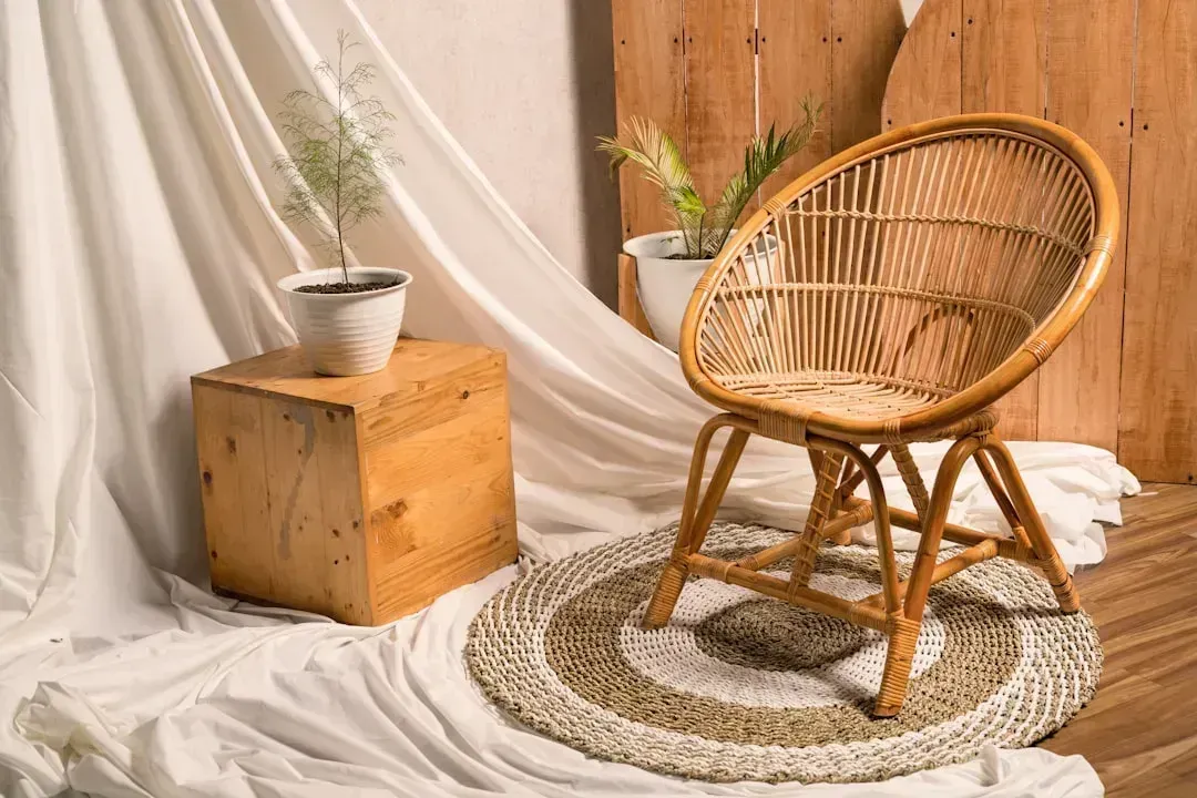
Cheap, trend-chasing furniture has powered plenty of quick room makeovers, but its appeal is fading fast among professionals. Fast furniture is finally slowing down, as the dreaded cousin of fast fashion, cheap designer dupes often made with inferior materials, are on their way out in the coming year. Clients, it seems, are asking different questions before they buy.
Designer Sally O’Connor has noticed the pattern directly with her own clients, who are “wanting to prioritize sustainability and quality, leaning towards timeless pieces made from durable materials that promise longevity over disposable options.” That does not necessarily mean bigger budgets. Instead, consumers are increasingly turning to vintage and thrifted finds when making more budget-conscious purchases, which gives a room more character than a mass-produced dupe ever could.
6. Giant Bouclé Cloud Chairs
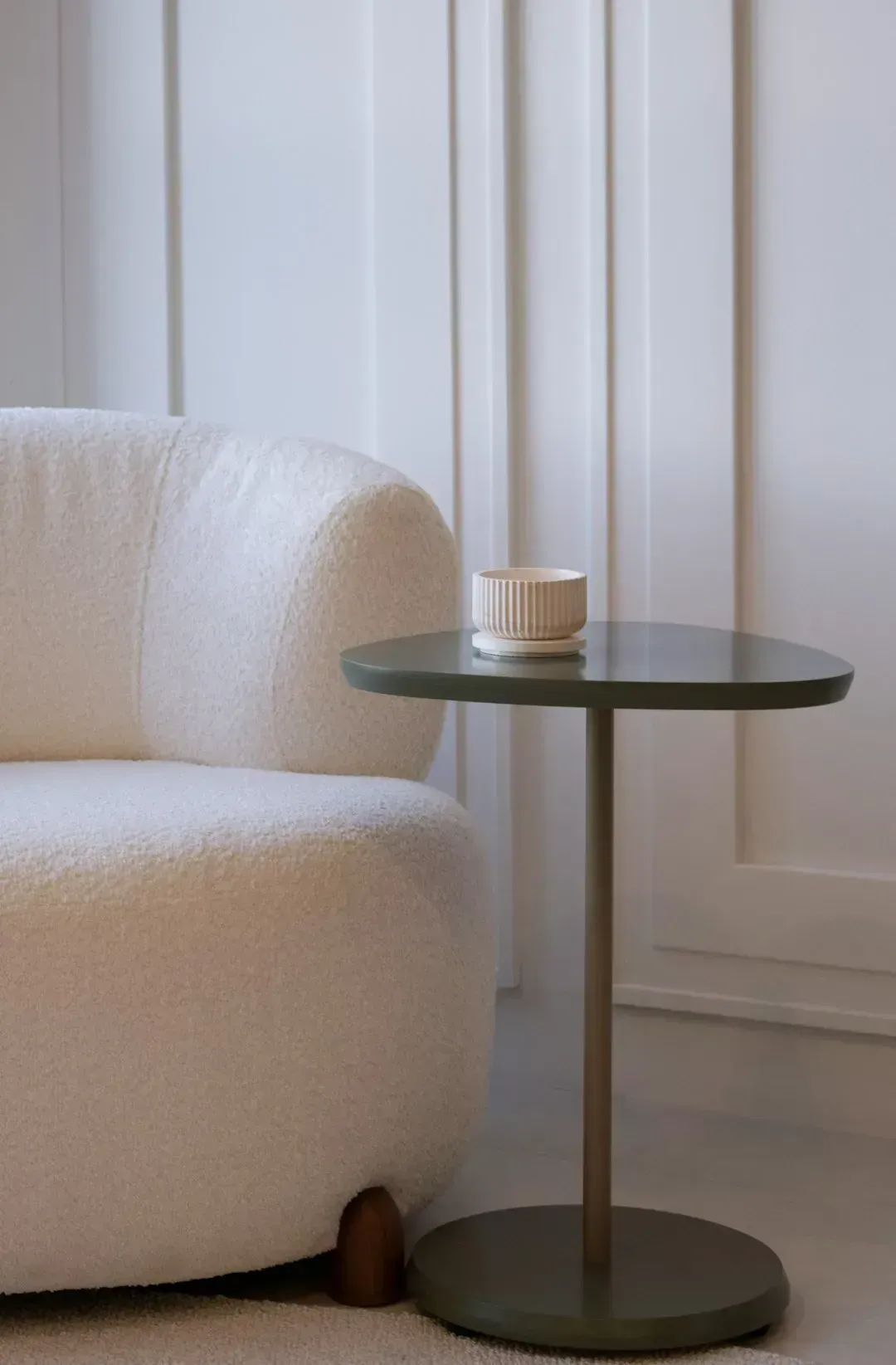
Bouclé took over living rooms for a very good reason: it looks soft, textural, and inviting in photos. The problem, designers say, shows up the moment someone actually sits down. If you’ve ever attempted to actually use a bouclé chair in your own home, this one won’t surprise you, since these stylish seats have a major form and function disconnect, especially if you’ve ever tried to keep one looking pristine, and that fluffy bouclé stays fluffy and pristine for all of five minutes.
Designer Janelle Patton is not ready to abandon the fabric entirely, but she has a strong opinion about one specific shape. She says the “giant round cloud chair that looks incredibly photogenic and is genuinely uncomfortable to sit in for more than 12 minutes has run its course.” Her suggestion is to look at bouclé in darker or colored versions rather than the ubiquitous cream cloud shape that has flooded social media feeds.
7. Gallery Wall Grids
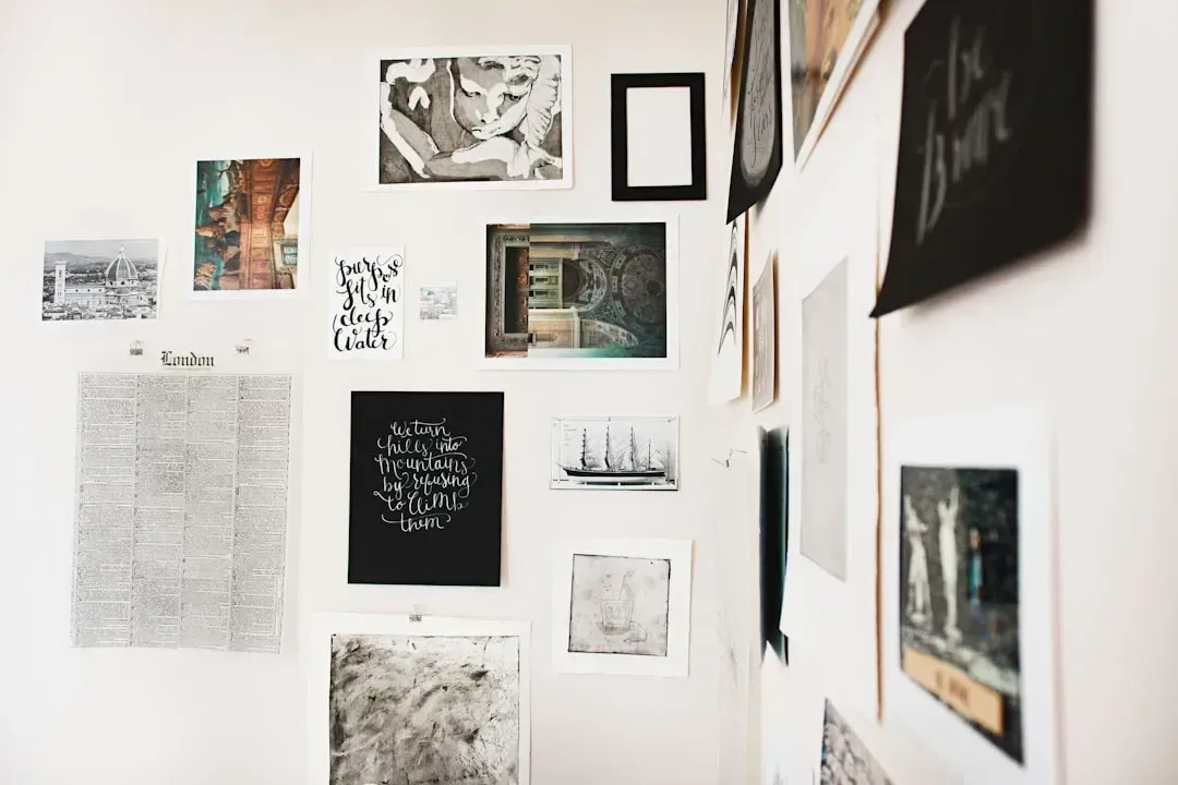
Filling a blank wall with a neat grid of matching frames has long been the go-to move for anyone without a design background. It is orderly, symmetrical, and easy to replicate from a store display. When staring at a large blank wall, the easiest solution might seem like buying a set of matching frames and calling it a day, since three frames by three frames, each one matching, will easily fill a space in a way that looks neat and orderly, but the gallery wall grid is a trend that feels more sterile than stylish.
Designer Janelle Patton has a pointed take on why the look falls short: “It became the thing people did when they wanted their home to look designed without hiring a designer, but it reads more like a checklist than a choice.” She recommends either committing to one large piece of art or building an eclectic mix of frames and sizes gathered slowly over time, since a genuinely eclectic mix of frames and sizes that was collected over time does so much more for a room.
8. Single-Tone Wood Furniture Sets
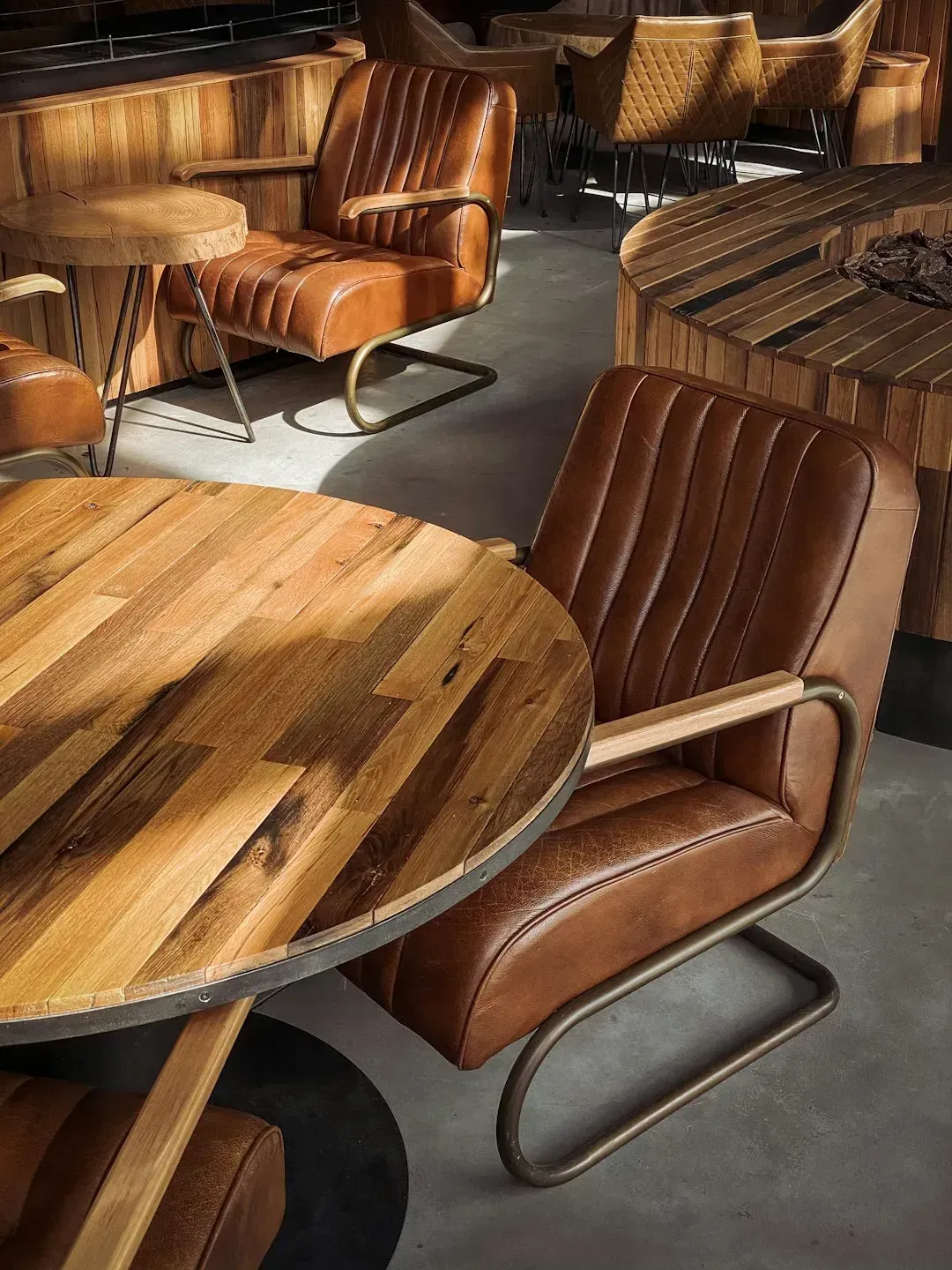
Matching wood tones across an entire room, all from the same retailer and finish, has been an easy way to make a space feel put together. Designers now consider it a missed opportunity. Filling a room with multiple wood tones isn’t for the faint of heart, and there’s an art to mixing woods, which is why so many people opt for a few brand-new, coordinated pieces from a major retailer, all in the same exact finish.
Designer Burcu Ercetin encourages clients to break that habit. In her words, “Mixing tones, such as walnut and oak, creates depth, and feels much more natural and layered.” The trick to making it work without looking accidental is to keep all of the tones within the same family of cool or warm so pieces play together nicely.
9. Fluted Millwork and Furniture
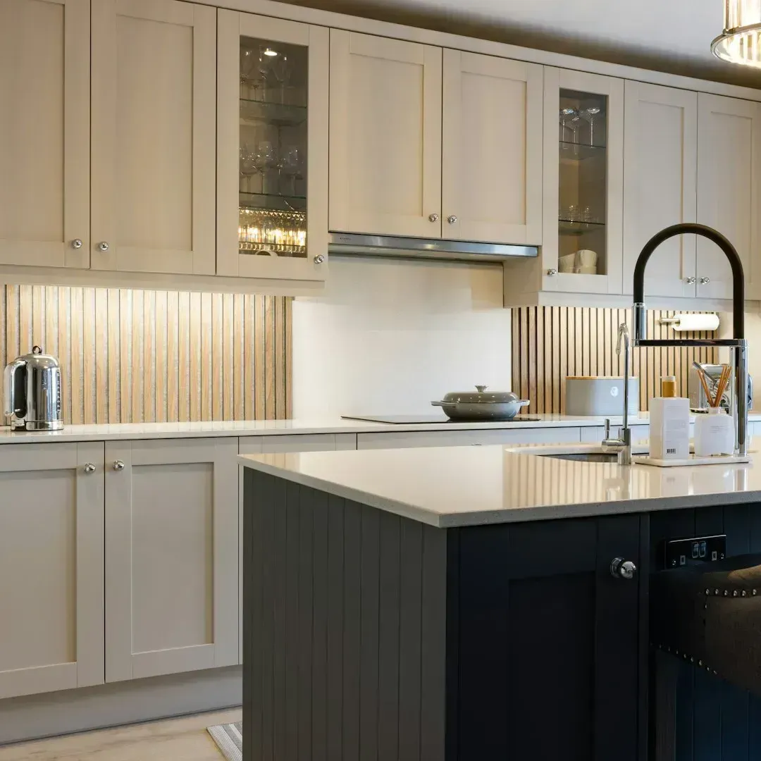
Fluted detailing arrived as a welcome break from years of flat Shaker cabinetry, showing up on everything from kitchen islands to coffee table bases. Fluted millwork and furniture has been all the rage for a few years, from cabinet doors and kitchen islands to dressers and coffee table bases, as a fun way to add texture to a piece. Its popularity, though, has arguably become its downfall.
Designer Kellie Reynolds admits she was part of the trend early on but now sees its limits. She explains, “I am guilty of this one, as many designers were craving a different door front after the everything Shaker trend, but fluted millwork has been overdone and doesn’t feel as timeless as a thin Shaker or flat-panel door front.” Her advice is to save fluting for smaller accents rather than permanent features like an island or full cabinet run.
10. Zellige Tile Overload
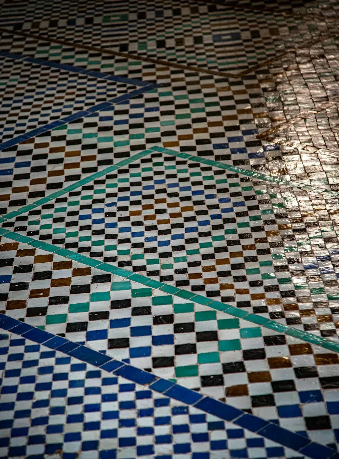
Handmade zellige tile brought warmth and imperfection to kitchens and bathrooms that had grown tired of flawless subway tile. Zelige tile has a hold on the design world at the moment, feeling organic and handcrafted with a storied past, yet it also looks fresh and light. The trouble is that its popularity has made it feel less special than it once did.
Designer Terri Brien puts it plainly: “I know this might not be a popular take, and it is beautifully imperfect, but it’s everywhere right now, and when something shows up that consistently, it starts to lose what made it special.” She goes further, comparing the neutral version of the tile to a much older design fad, saying “Neutral zellige tile is beginning to feel a lot like the gray trend from years ago, not that it’s bad, just very overdone.”
11. Matte Black Hardware
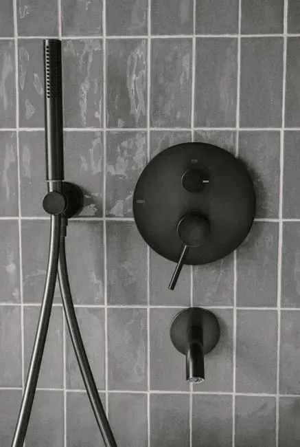
Matte black cabinet pulls and light fixtures defined an entire era of kitchens, offering a sharp, high-contrast look against white cabinetry. That contrast is now reading as dated rather than sleek. Designer Nicole Spurlock explains that “All matte black hardware and lighting against white cabinetry will definitely date your home in 2026, since this high-contrast trend peaked really hard in 2020, and the bigger the trend, the harder it falls.”
The shift away from matte black lines up with a broader move toward warmer, more lived-in kitchens. Instead of opting for harsh hardware that contradicts today’s love for lived-in, layered interiors, designers are opting for brass finishes. Brass softens a kitchen’s overall feel and tends to age more gracefully than a stark black and white contrast ever could.
None of this means these looks will vanish overnight, or that anyone with a curved sofa or a bouclé chair needs to run out and replace it. Trends in home design rarely die so much as they fade, then quietly return years later with a new name and a fresh angle. What designers are really describing is a shift in mood, away from spaces that look perfectly finished and toward ones that feel collected, mixed, and a little more personal.



Leave a Reply